I don’t know if any of you experience this, but every time a year draws to a close, memories seem to come flooding back to me. Over the last few weeks, I’ve been reminiscing about my very first project from when I was an intern in India. It is one of the most interesting projects I’ve ever worked on, and taught me invaluable lessons in design, technology, and stakeholder management.
While in college, I simultaneously interned for an advertising/ content agency. After shadowing a project lead for a few months, the agency thought I was ready and could be entrusted with my first project; in this case for the Indian banking giant: ICICI Bank.
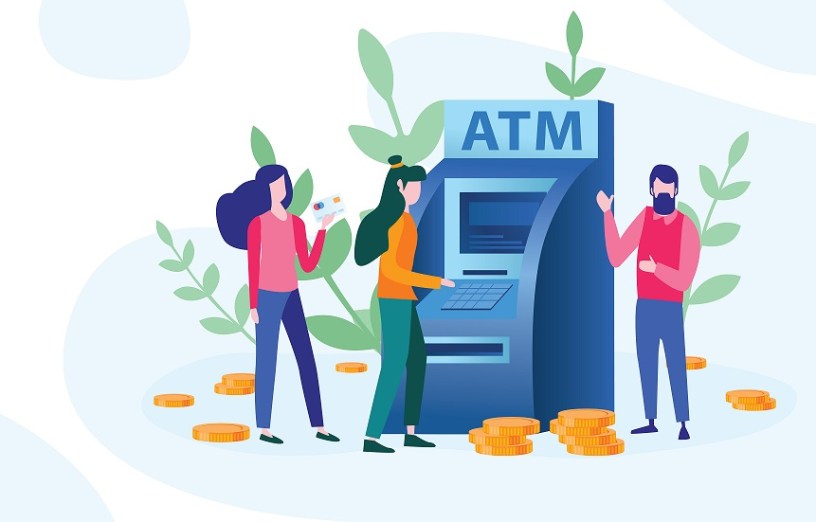
The project sounded simple enough: Lead the design and implementation of 54 ATM screens for the bank’s ATM machines. The client shared their style-guide and the 54 scenarios for which the screens were to be designed (‘Withdraw money’, ‘Deposit money’, ‘Request deposit envelop’, ‘Confirm previous request’ etc). Apart from me, the project had two other team members- the copywriter who would write the content / instructions, and the visual designer who would design the screens. A simple enough project for a beginner, right? But we were soon to discover that the project came with its own complexities.
First, ICICI bank uses two different types of ATM machines- DIEBOLD and NCR. While the screen size on both machines was identical, their button coordinates differed by a few pixels each. As the messages and instructions on the screens had to align perfectly with the ATM buttons, we ended up having to design two sets of 54 screens each instead of one (there by almost doubling the original project scope).
Second, the bank did not have a sandbox for testing the screens. We were only allowed to test on a live ATM machine during the daily refresh (ie, when currency is loaded into the machines). In India this meant at 12 midnight!!
Third, once we had completed designing the screens in English, the client requested us to localize the same in 10 Indian languages. As can be expected- the translated text took up additional space. Given the constrained size of an ATM screen, it was challenging to accommodate the translated copy as well as the branding for many of the 54 scenarios.
Almost everything I did on that project was a mistake, but I learned from my errors and from the feedback of senior colleagues. The project introduced me to the social nature of design. For example, when we went out at midnight to test the screens, it was strange to jump over homeless people sleeping on the steps of the ATM kiosk only to be confronted by hundreds of thousands of INR (the Indian currency) being loaded into the machine. And- though my colleagues always accompanied me on these tests- my mother made sure my younger brother also tagged along (to safeguard the reputation of a young daughter going out at midnight to do office work)!
The project taught me how to manage clients, timelines, budgets, and team members (and also family members, esp. during a long and complex project). It taught me how to analyze for, and implement, design, and how design, content, technology, and people inform each other. It strengthened my passion for good design in everyday artefact. And it was a proud moment when, after working for eight months, I had the opportunity to demo the project to global teams from Diebold & NCR that had been flown in by ICICI Bank to review the new screens on their respective ATM machines.
Though ICICI Bank has evolved their ATM screen design over the years, the yellow-orange-red-white theme we created has remained unchanged and become something of a design icon in India: ubiquitous, unambiguous, and working harmoniously on multiple types of machines. This last one was a critical success of our project. Before our screens, it was common to find ATM machines in India on which screen text would not line up with the respective physical button, thus resulting in misunderstood requests- the machine might have shown the ‘Change PIN’ screen when you had, in fact, pressed the button for money withdrawal.
The screens we designed corrected this. It was a moderately simple fix but greatly improved customer experience; and since then I’ve not seen misaligned ATM screens from any bank anywhere in India. In conclusion, I’m not ashamed to say that I have withdrawn many unnecessary amounts of money just so I could stand in front of the ATM machine and admire the screens I delivered so many years ago 😊
