User Interaction is not a new concept! It can be traced back to the principles of Vitruvius, the ancient Roman architect and engineer who lived between 80 B.C and 15 B.C.
The Vitruvian Triad
Firmitas: The design must be solid- stand the test of stress and time.
Utilitas: The design must be useful to the individual and/ or community.
Venustas: The design must be aesthetic that delights the senses.
In 1990, Jakob Nielsen explained his 10 general principles for interaction design. These principles are commonly known as “heuristics” because they are more like rules of thumb and not meant to be used strictly.
Though Nielsen’s principles are more commonly used for interaction design, they can be used with equal advantage to training content design. Some applications could be as follows.
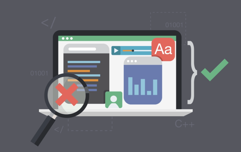
1. Visibility of system status:
In e-learning: Content Menu, Content Landing Page, Cookie crumb showing location of page, Whether content is online or offline, Clear navigation path.
In paper-based training content: Table of Contents, Page number with reference to total number of pages, Color coding for easy identification.
2. Match between System and real world:
In e-learning: This principle ensures that creative design is balanced with familiarity in the design of both e-learning and paper-based training content. For example, designing an e-learning course that uses the same shortcuts as Microsoft Windows will ensure that the Learner does not have to spend most of their time learning new shortcuts. They can rather use the time on learning the new information instead.
In paper-based training content: Instead of designing training content as a plain document, it can be designed as an entertainment magazine, with a case study, images, ‘advertisements’ showing the advantages of learning the content, etc. In fact, the old concept of infomercials is based on this principle.
3. User control and freedom:
In e-learning: Provide an easy to understand navigation pattern with clear usage instructions. At the same time, provide the Learner with freedom to decide which pages they want to visit/ which games they would like to play, etc (freedom). Make the assessment mandatory (control).
In paper-based training content: Link to related content elsewhere in the document with clear references and page numbers. Don’t forget footnotes and citations.
4. Consistency and standards:
In e-learning: Design the content to conform with industry standards like SCORM, responsive principles, etc.
For both e-learning and paper-based training content: Follow organizational style guide.
5. Error prevention + 9. Help users recognize, diagnose, and recover from errors:
In e-learning: Explain features of the content as an introduction, Provide hints and tips that fade in and out to help the Learner inconspicuously.
In paper-based training content: Explain how to use the document with images, color codes, explanatory keys, etc.
6. Recognition rather than recall + 7. Flexibility and efficiency of use: For multicultural audiences, use visual cues like icons and images to explain functionality. Design should be intuitive and thus effortless to use.
8. Aesthetic and minimalist design: This principle should be interpreted in the context of culture and time. For example, what is considered aesthetic in Japan will be different from its aesthetic counterpart in India or Sweden. Design considered aesthetic in 2000 will not be considered current and aesthetic in 2015. Minimalism is perhaps the more important word here.
10. Help and documentation: Provide general and contextual help.
